PureBalance
Case Study for HSE
360° Conception & Design
BRAND STRATEGY FOUNDATION
In a phase of life where physical and mental changes become more noticeable, the need for balance and well-being is essential. PureBalance is more than just a dietary supplement – it’s a philosophy of life. The brand seamlessly blends purity and transparency with a holistic approach to vitality and inner equilibrium.
With carefully selected, natural ingredients, PureBalance supports women in finding their inner harmony—whether through improved sleep, stronger joints, or a balanced digestive system. The brand’s minimalist aesthetics reflect its core values: clarity, naturalness, and trust.
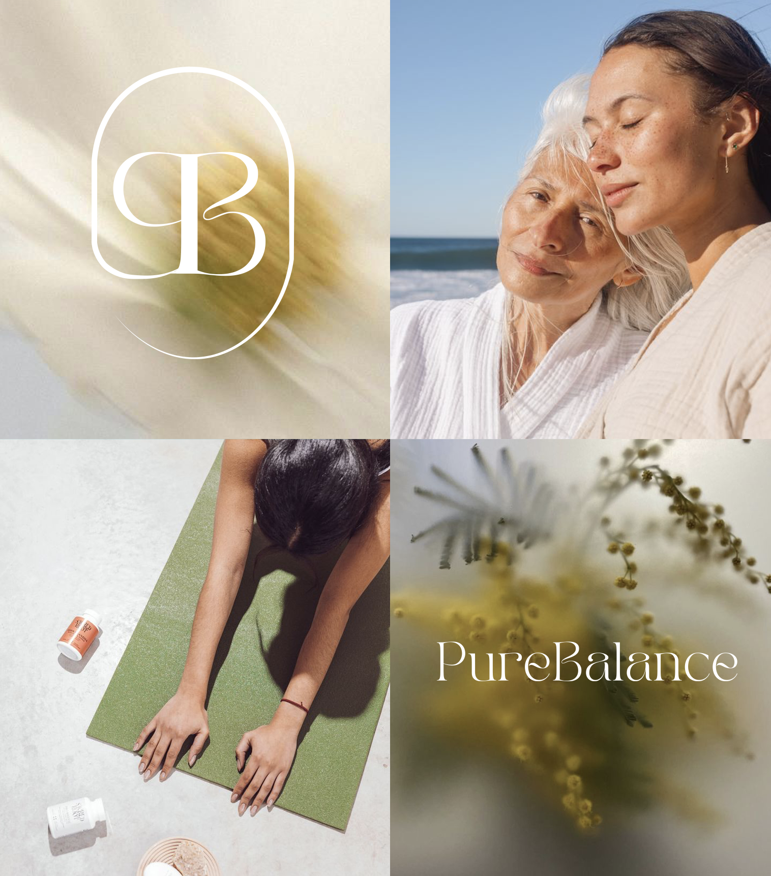
The visual identity of PureBalance embodies this philosophy. A modern, refined design language combined with natural elements creates a connection between tradition and innovation. The campaign "Find Your Balance" tells authentic stories of women who enhance their well-being with PureBalance—every single day.
SERVICES
Brand Strategy
Brand Campaign
Visual Identity
Logo Design
Packaging Design
Photography Direction
Content Strategy
Social Media Concept
Storytelling
E-Commerce Experience
Creative Direction
Marketing Communication
Iconography
Concept
Creative Direction
POSITION:
Creative Lead, Creative Director
DATE:
October 2024
Creating Balance
for a Lifetime.
PureBalance

Mind | Body | Soul
Natural, clean ingredients that convey purity and transparency.
Supporting physical, mental, and emotional balance to live in harmony in all aspects of life. A brand that offers the best of both worlds – purity and balance – for women over 50 who prioritize their health and vitality.
More than just a product – PureBalance is a lifestyle philosophy, focusing on holistic health and balance.
CAMPAIGN IDEA
.
Find Your Inner Balance
Visual Identity:
The purity and untouched nature of the ingredients are highlighted by a soft-blurred glass effect, symbolizing transparency and protection.
Design Philosophy:
The brand design blends a timeless aesthetic that reflects the natural origins of ingredients with a modern lifestyle.
Key Visual Elements:
A balance between nature and innovation lies at the heart of the brand identity.
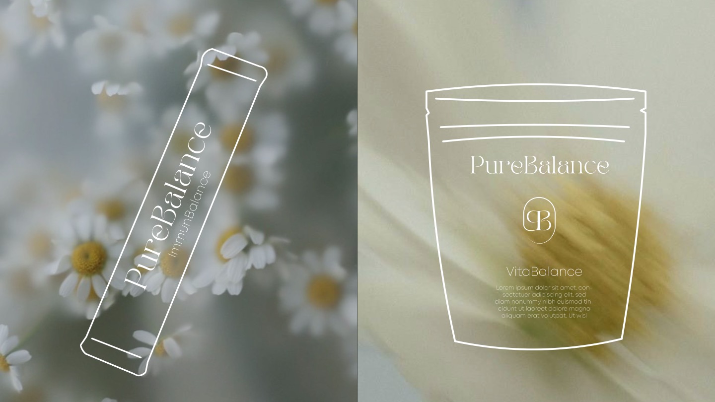
A secondary logo integrates the letters "P" and "B" into a capsule shape, symbolizing the product form and protection and purity.
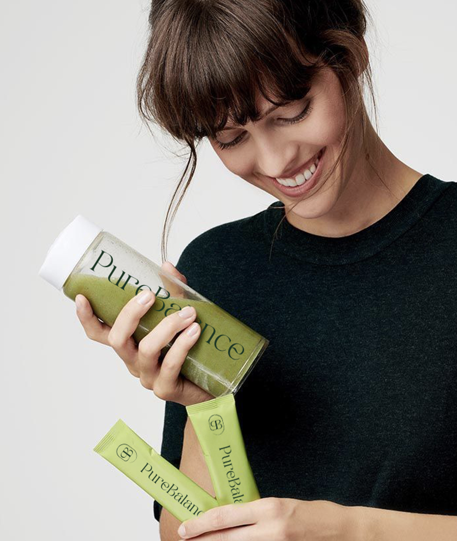
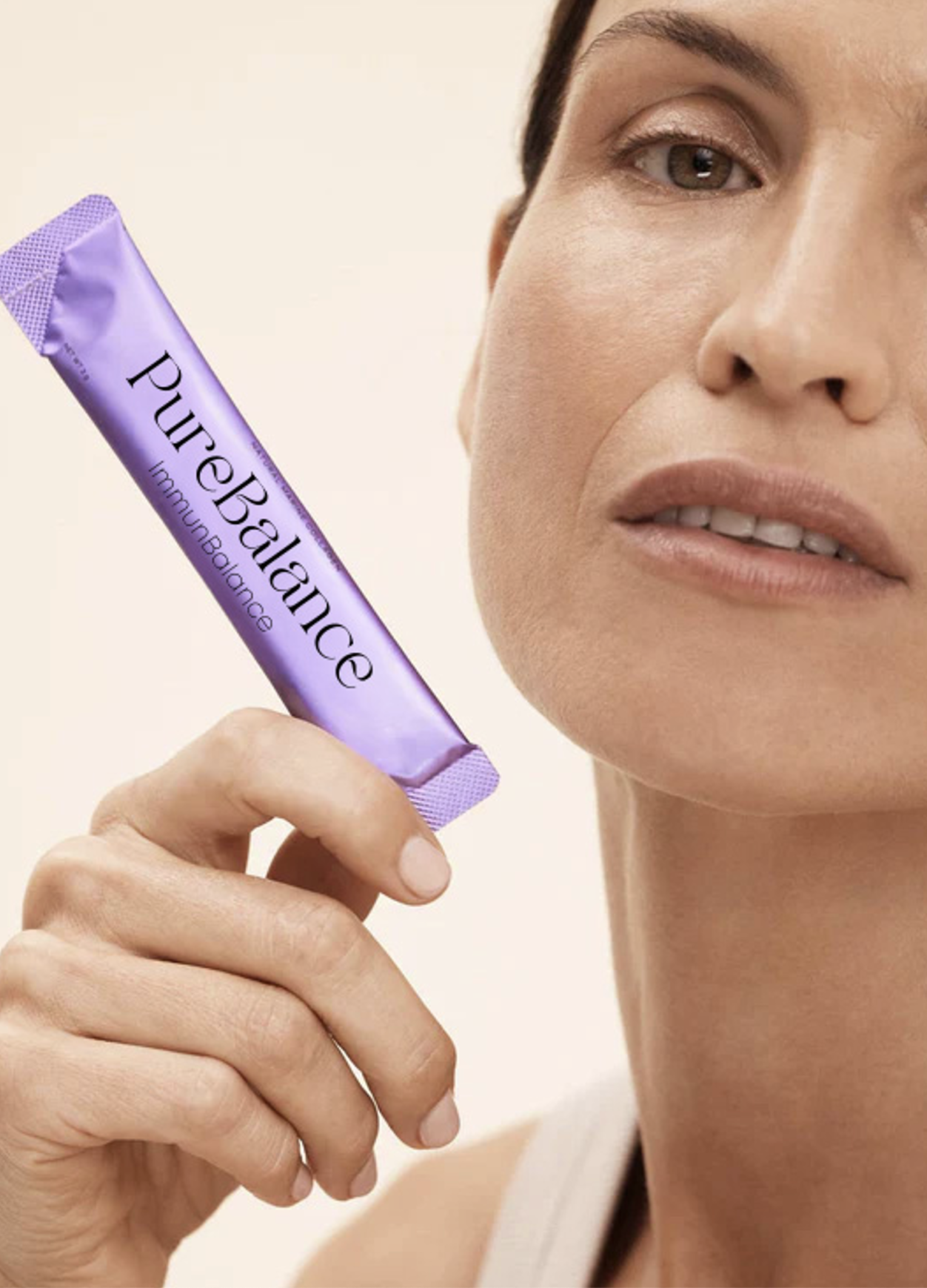
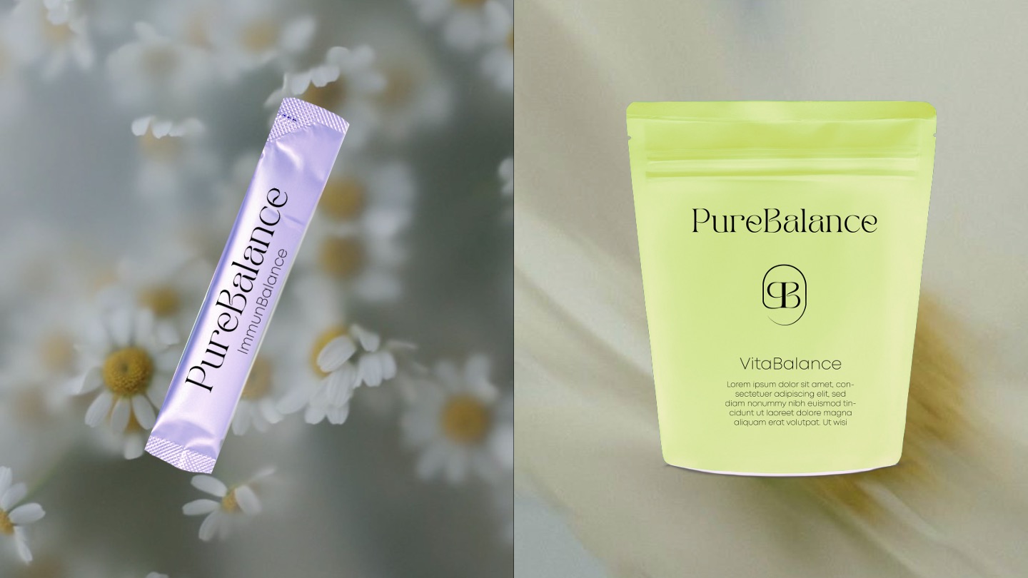
PRODUCT LINE
.
Balance for Body & Mind
Thoughtful Product Naming for Holistic Well-Being
The PureBalance product line embodies a purposeful naming strategy designed to communicate each product’s unique benefit with clarity and simplicity. This approach ensures customers instantly understand how each product contributes to their health and well-being.
In the PureBalance collection, the word "Pure" is paired with a thematic term that directly reflects the product’s function. This intuitive system highlights the specific health area the product supports, making it easy for customers to identify the right solution for their needs.
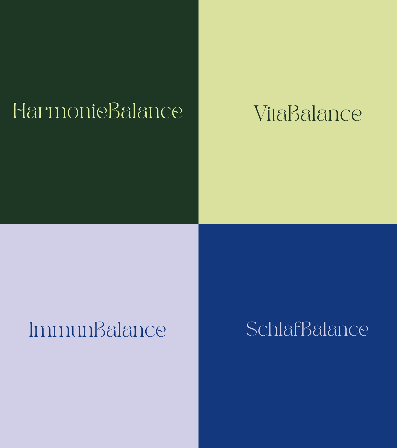
Examples of the Naming Strategy:
HarmonyBalance – Supports digestive health
VitaBalance – Promotes joint care and flexibility
ImmunBalance – Boosts immune system resilience
SleepBalance – Enhances restful sleep and relaxation
By combining simplicity and focus, the PureBalance naming concept aligns with the brand’s philosophy of natural, holistic health, ensuring a seamless customer experience and reinforcing trust in the brand.
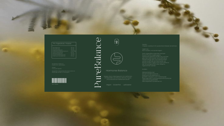
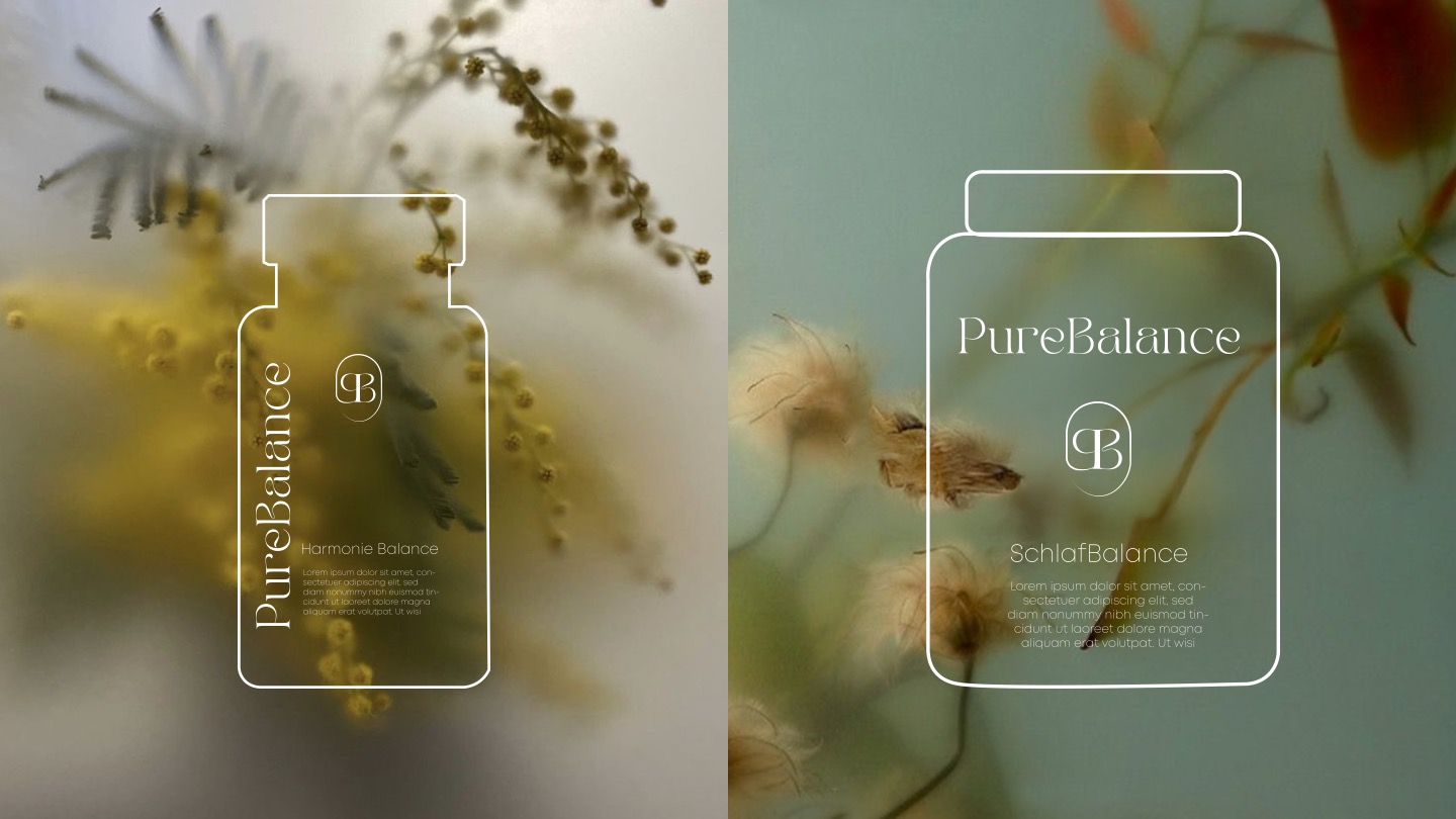
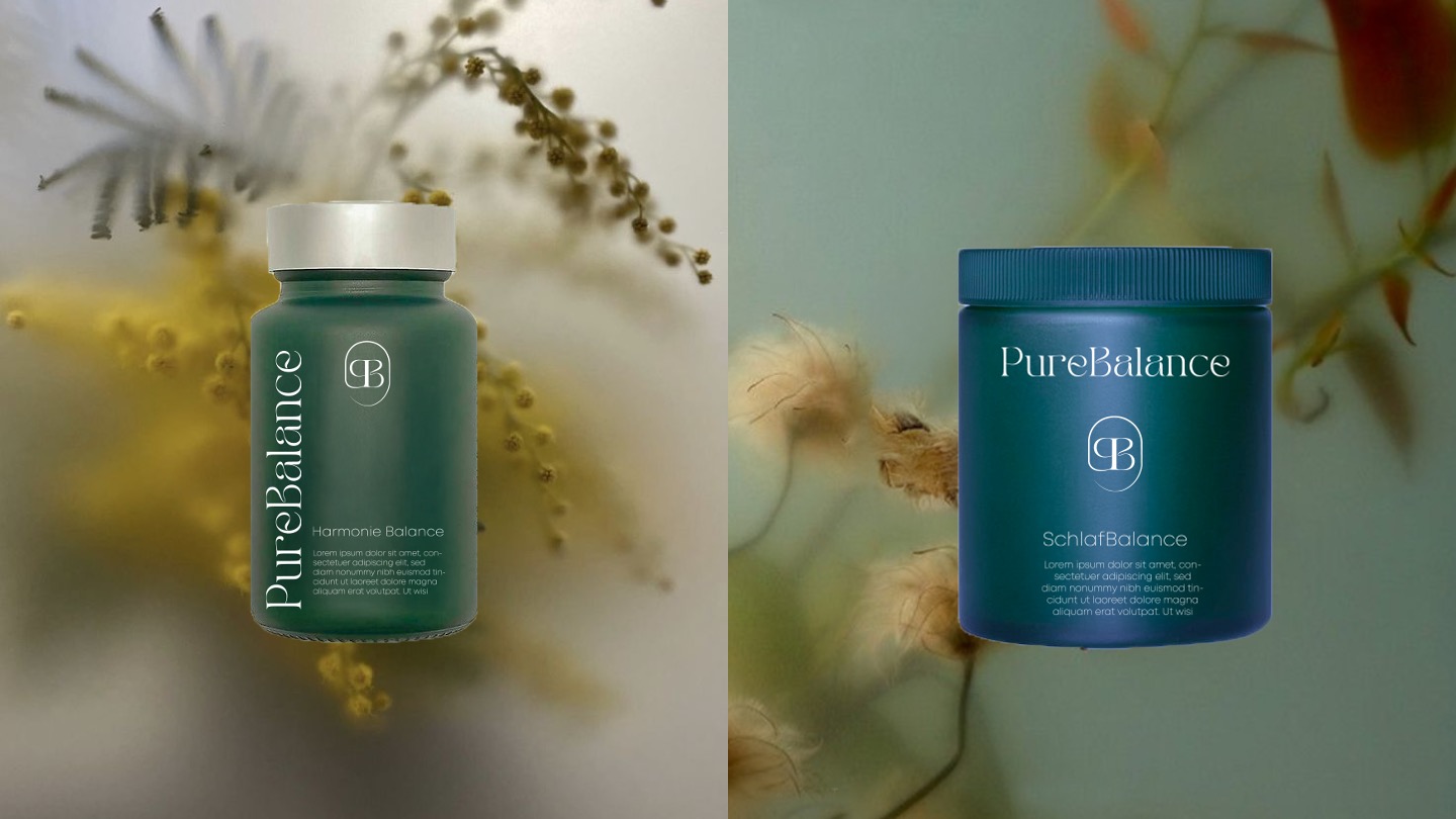
PACKAGING
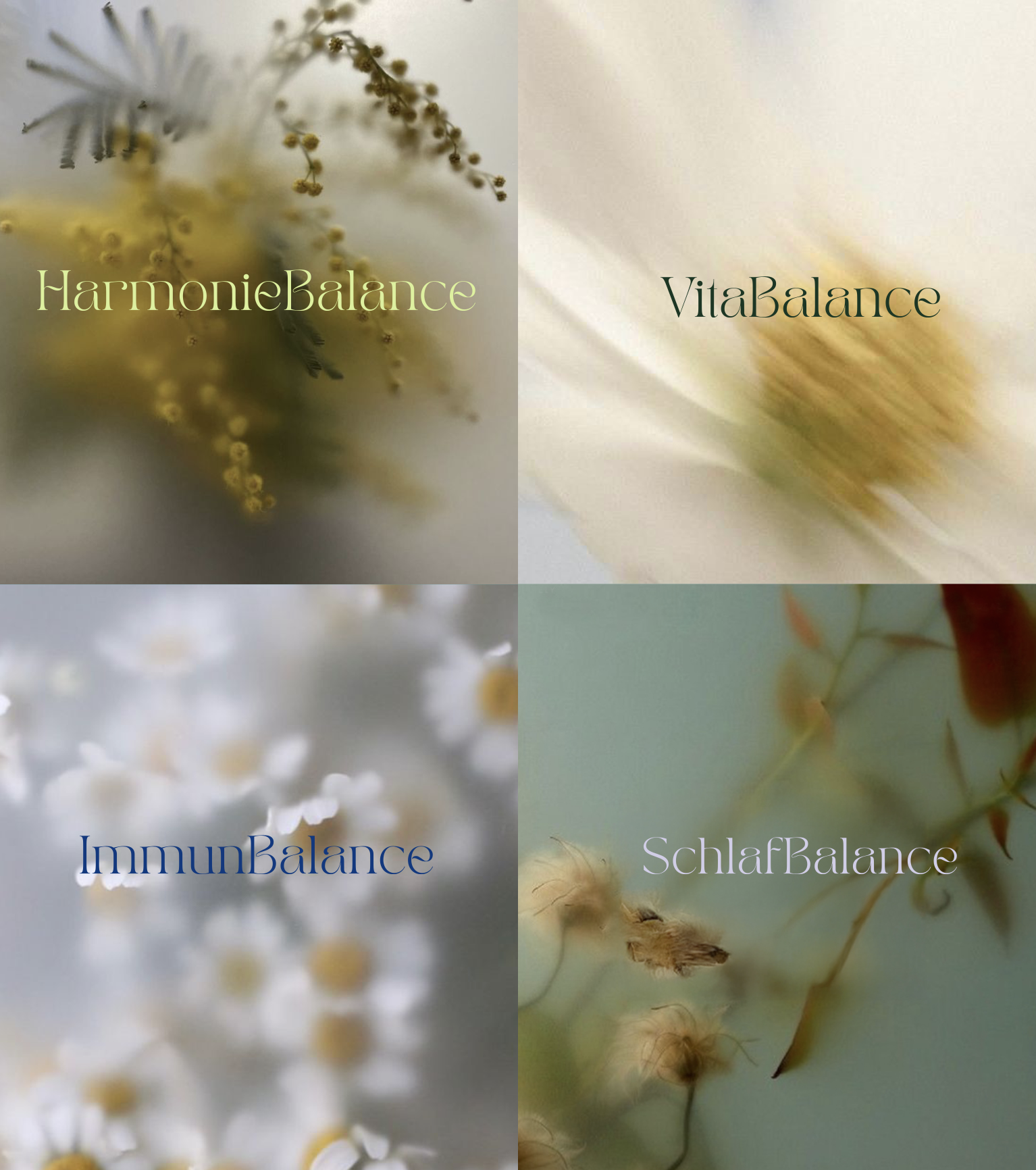
Natural Ingredients in Focus:
Ingredients such as chamomile blossoms are presented in their pure, unprocessed form behind a slightly blurred glass pane. This emphasizes the natural and pure character of the PureBalance products.
Glass Pane
with Blur Effect:
The slightly blurred glass pane gives the ingredients a mystical yet visibly pure and untouched appearance. It symbolizes the careful handling of natural substances while also creating a modern, minimalist aesthetic.
Symbolism of
the Glass Packaging:
The glass acts as a protective shield that preserves the ingredients in their natural form. Its transparency signals trust and openness while keeping the ingredients visible through the glass, emphasizing the connection between nature and the product.
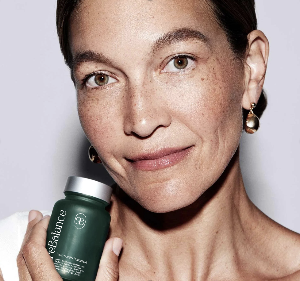
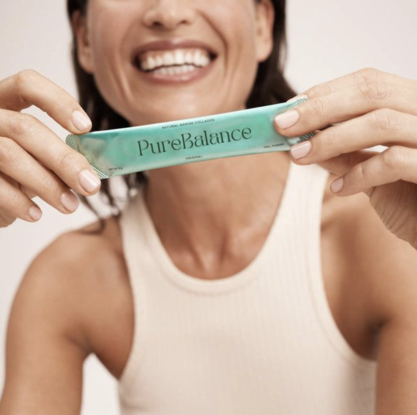
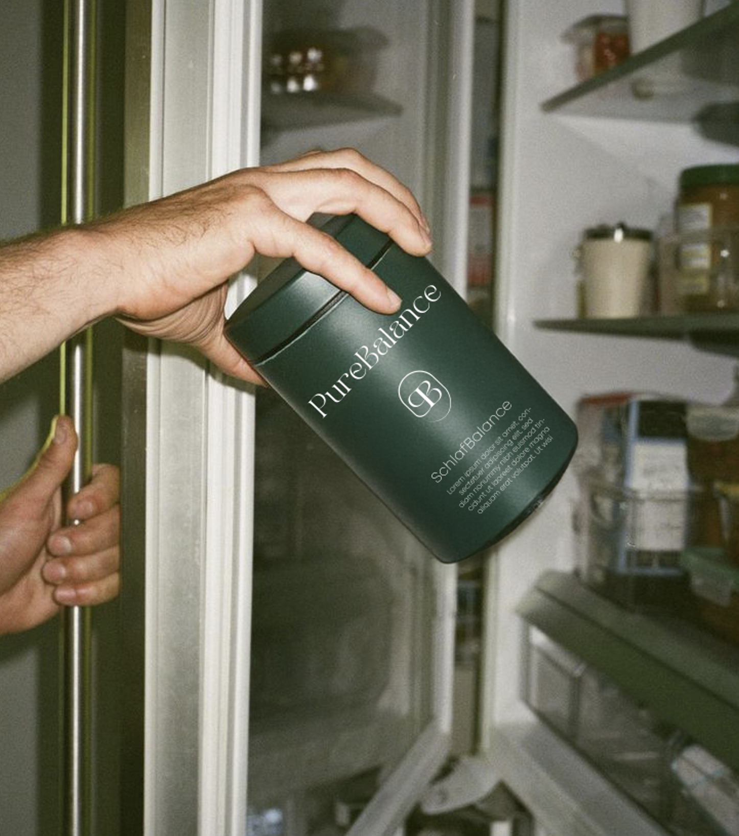
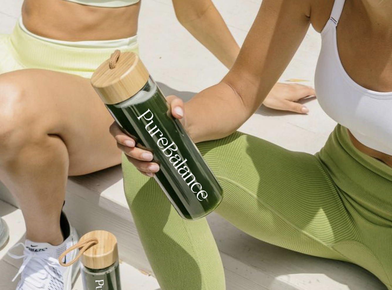
PRODUCT SHOOTING
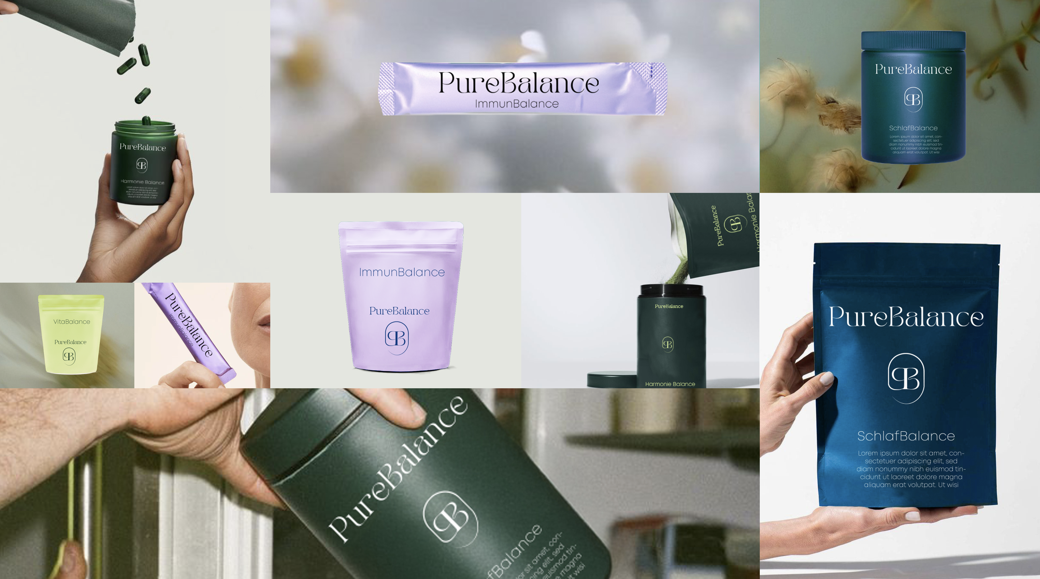
STORYTELLING
.
Emotional Connection
Through Authentic Stories